Fioritura Sweet
- Joel Pozzebon
- Mar 26
- 1 min read
Fioritura Sweet is a dessert catering and delivery service that seeks to convey sweetness and quality through its visual identity. The design combines a welcoming aesthetic with graphic elements that reinforce the brand's personality, ensuring an engaging presence on social media and other platforms.
Logo and variations

The Fioritura Sweet logo features a fluid and elegant typography, combining soft, pastel tones to reinforce the brand's sweet and inviting aesthetic. Versions have been developed in different color combinations to suit different backgrounds and applications.
Pet

To bring dynamism and relatability to the brand's identity, a mascot was designed: a friendly squirrel that embodies the business's friendly and creative spirit. Different expressions and emotions were developed for the mascot, allowing it to be versatilely integrated into publications and graphic materials, adding personality.
Photo retouching and social media presence


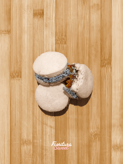
To improve product presentation, dessert photos were retouched, highlighting their texture, color, and visual appeal (images with the logo have been retouched, while those without are the originals). These optimized images are integrated into social media posts, maintaining a coherent graphic identity that reinforces Fioritura Sweet's image.
With this proposal, Fioritura Sweet achieves a warm and professional visual identity, ensuring the brand stands out in the competitive world of dessert catering and delivery.


